Maison Rosetti
Packaging Design & Brand Concept
Maison Rosetti is a fictional artisanal chocolate house founded by two women — a mother and daughter united by their passion for craftsmanship, elegance, and uncompromising quality.
Branding concept
Together, they created a brand where traditional techniques meet refined sophistication. Every chocolate is made with carefully selected natural ingredients, sourced locally whenever possible, and crafted to celebrate both flavor and beauty.
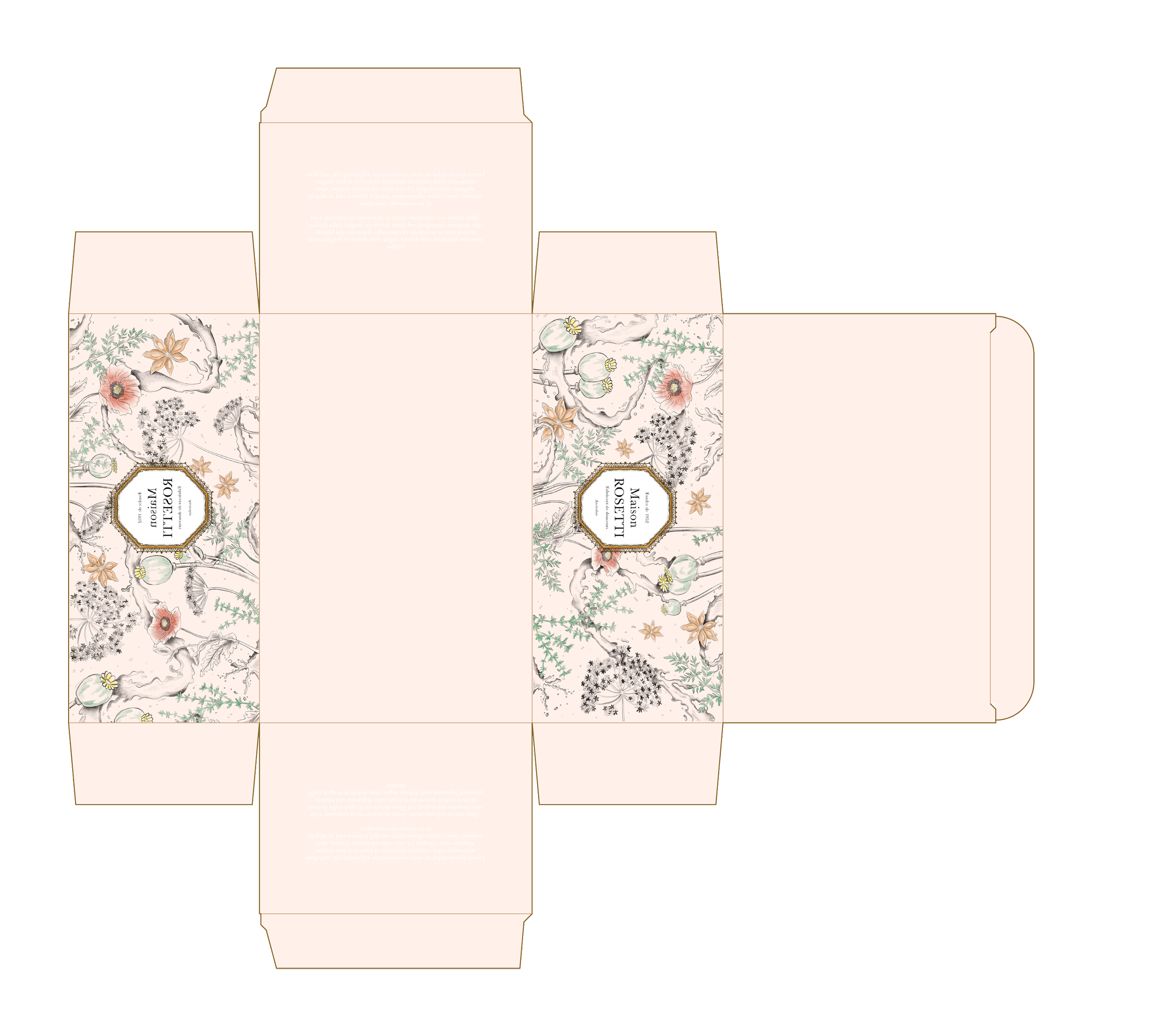
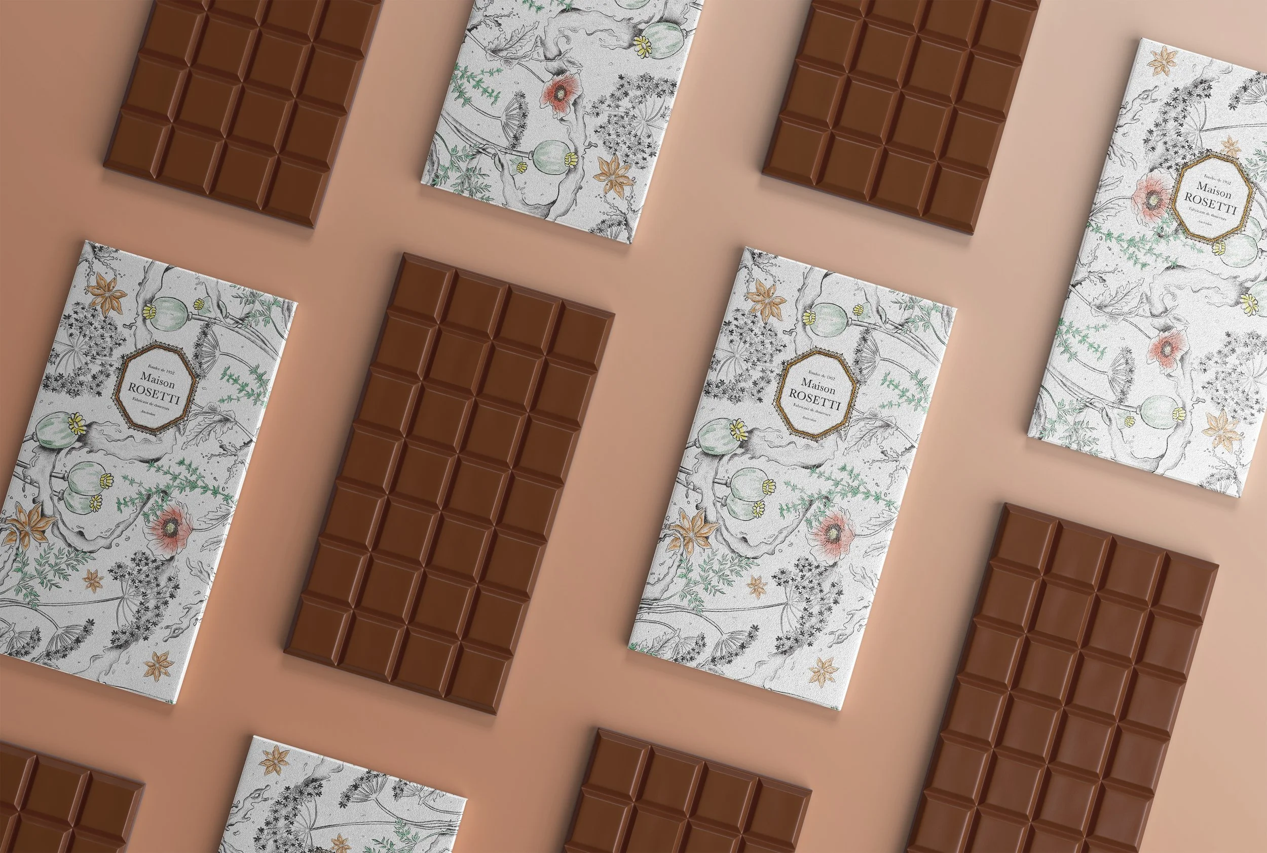
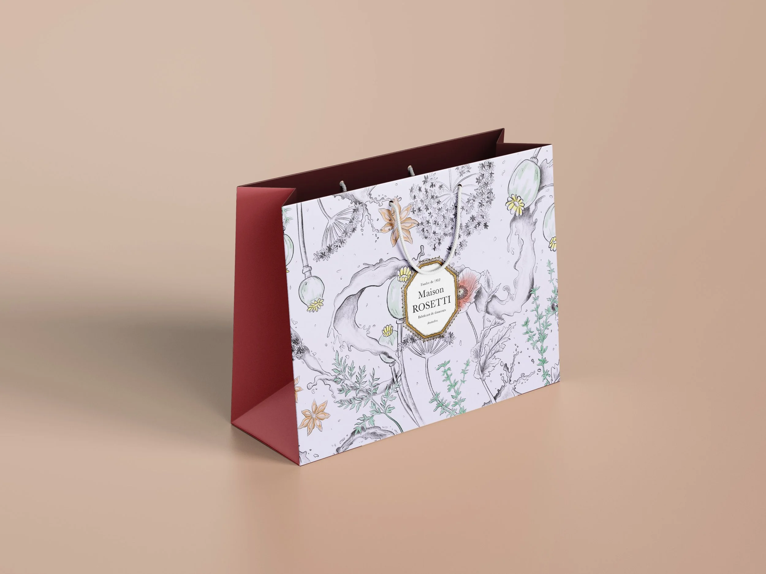
For this concept, I developed a premium packaging identity that reflects the Maison Rosetti philosophy: timeless, tactile, and delicately luxurious.
Packaging design
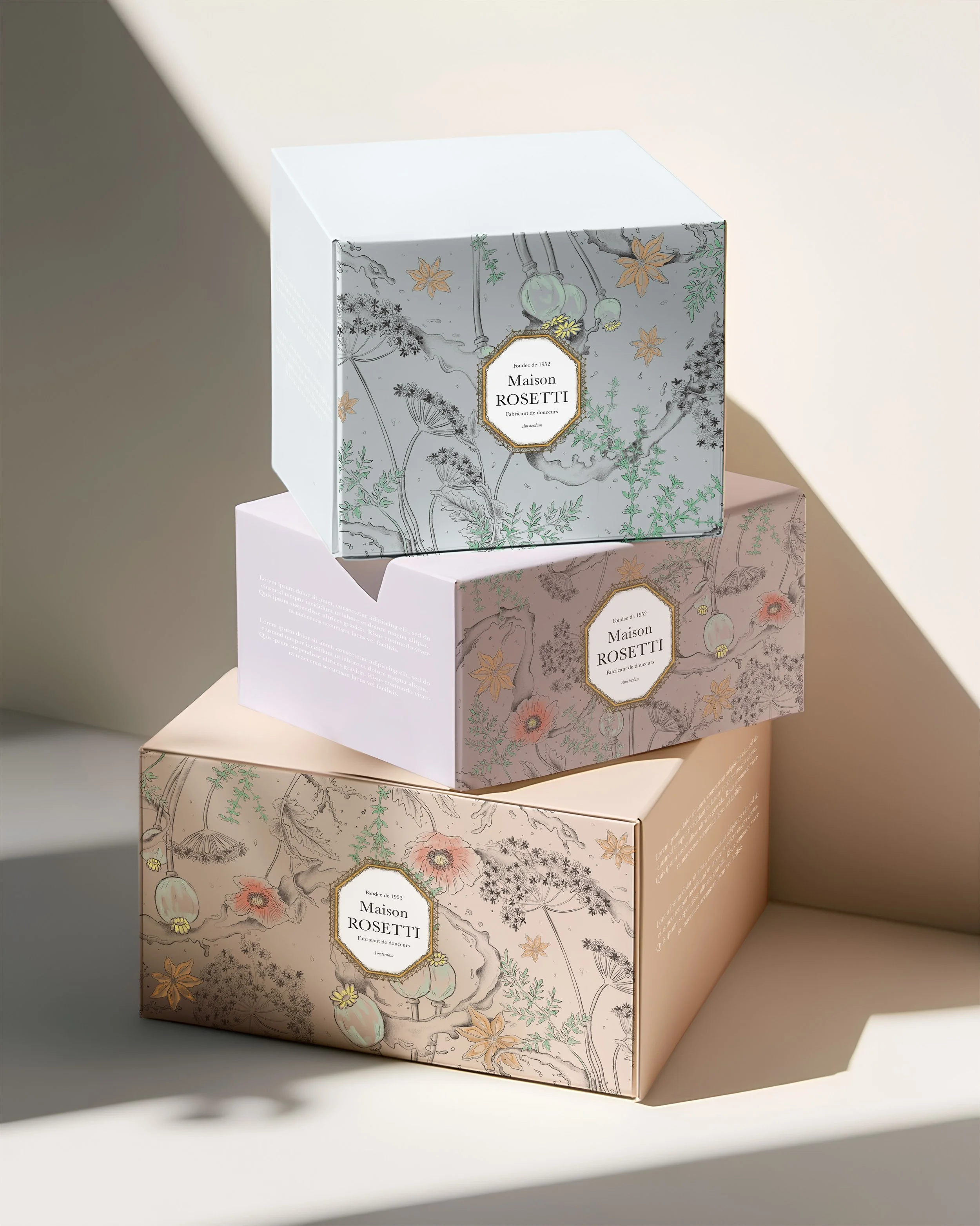
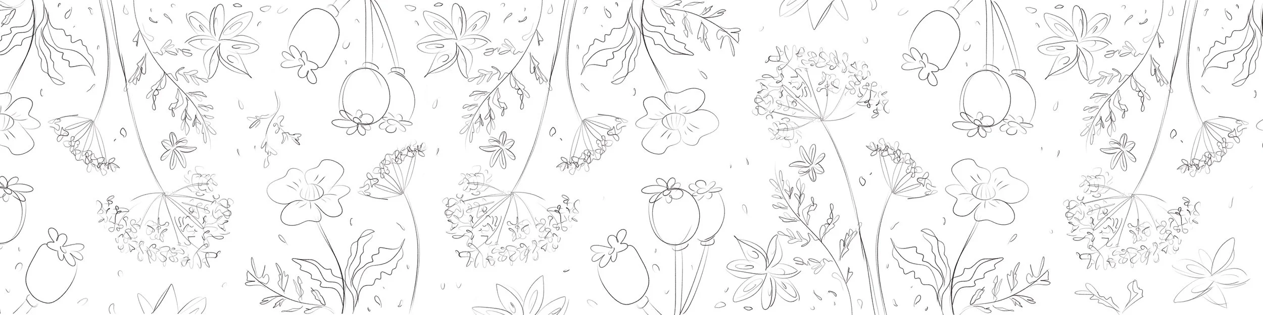
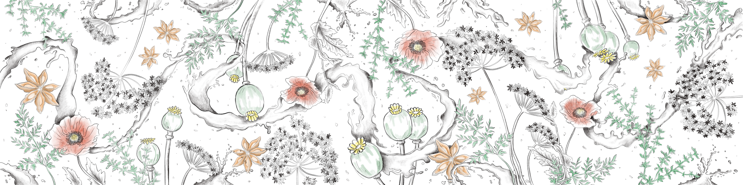
The packaging artwork was hand illustrated using pencil and watercolor, then reproduced on high-quality durable paper stock to preserve texture and richness. Each drawing highlights the ingredients behind the recipes — from fresh thyme and poppy seed to heavy cream from local dairy farms.
The result is a packaging system designed to feel personal, artisanal, and elevated — turning each box into an object worth keeping.
Want something similar?
Design process
Packaging illustrations were hand-rendered in pencil and watercolor, showcasing the natural ingredients used in the chocolates. This analog approach adds tactility, softness, and authenticity.
Printed on high-quality textured paper, the final packaging transforms each box into a keepsake object.

Maison Rosetti’s identity balances classic European elegance with artisanal warmth.
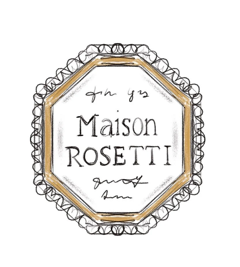
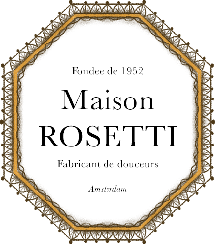
The logo was crafted using refined serif typography, designed to feel timeless, premium, and quietly confident. Inspired by heritage chocolate houses, the mark uses elegant spacing and balanced proportions to create a sense of trust and sophistication.